I love Charger8232’s idea of a Privacy Flag. However, I don’t love the design they proposed. In their post, I explain my disagreements.
As a form of vexillographical discussion, I would like to propose another design as the flag under which we anonymously toil in secret (I wish).
First off, nods to Charger8232’s design - 1400x900 dimensions, and use of EU’s Dark Power Blue (#003399) color. Love it.
Where we differ:
Designs
A shield, representing how we must actively guard our privacy. A lock, obviously, to show we want security with our privacy, and a dove showing that we just want to be left the F alone and peacefully not be subject to a mass surveillance state. We’re not trying to be sketchy or do illegal stuff, we just want to be peacefully left the F alone.
Colors
Again, same use of Dark Power Blue, representing freedom and a nod to the GDPR. White representing peace. Black representing how I don’t want people to see me. Color of field: Redacted.
Extras
Stripes to make it a bit more visually interesting. A lack of EXIF and meta data as the subtle fait accompli.
The color scheme is similar to that of Estonia. While Estonia is a leader in the EU’s digital governance space, this is unintentional. As much as I liked Espresso Macchiato in EuroVision this year, there’s no direct nod to Estonia.
I didn’t want to just say “uh, I don’t like it” and complain without doing something. So here you go.
This is just a gentile reminder that if it’s truly a flag design, it should work just as well and be readable when hung from the short side.
Looks great. Maybe a slightly simplified dove? Maybe even a polygon style dove as a nod to the digital.
Can somebody make a Top Gear meme of these two flags side by side, but the guy says “I like this one better” to the one with the dove ?
Then you have five symbols:
. Freedom/ independence (darkblue)
. Peace/ harmony (white and dove)
. Active defence (shield)
. Security (lock)
. Privacy/ unseenedness (black)
I personally associate freedom with white because its like a piece of unpainted paper. I associate peace with green because it is the color of plants which symbolizes nature.
If I understand security, it is a contrast to the active defence in that it is passive defence. If so, you could possibly play around with how these symbolically relate to each other. For deem looking at them as a two sided unity.
I actually really like this one with the shield and the lock. I think that’s a fantastic idea.
EU’s Dark Power Blue (#003399) color.
Is this because you like the color or you think using an EU color is appropriate here? Cause if its the latter, EU is a privacy nightmare so hard disagree.
It was because that was mentioned by the original post as why they picked all blue. Which was largely about the GDPR specifically. So I went for it on that one item.
to be fair, and playing a bit of a devils advocate, but i think privacy is a nightmare on most places on the planet with enough tech infrastructure to make surveillance happen.
While that is true, EU is leading the world in some privacy invasions. Be it age verification or various initiatives to try and break E2EE. Those kind of efforts do not yet exist at even countries we would all agree are oppressive.
The hand design is far superior to this one
I’d like to commend your attempt here, and not sound discouraging or anything like that. Personally though, I like the other design a little bit better. Like another commenter suggested, this design seems to evoke security more than privacy. The shield and lock seem to be pretty commonly associated with those other meanings already. The dove being inside the lock definitely seems to overcomplicate things a bit too.
That being said, I do think your coloration and black undertones look better though and overall there’s a bit more visual interest.
I appreciate it, and I threw this together in about 10 minutes, so it’s just a spitball idea. Rather than seeming purely disparaging to the other person and their design by saying I don’t like it and not offering anything else constructive.
Still think you/we should go for the Human Rights logo…

Article 8 is about the right to privacy.
I completely agree. This logo is the only one that doesn’t look like its been made in MS paint. No hard feelings meant.
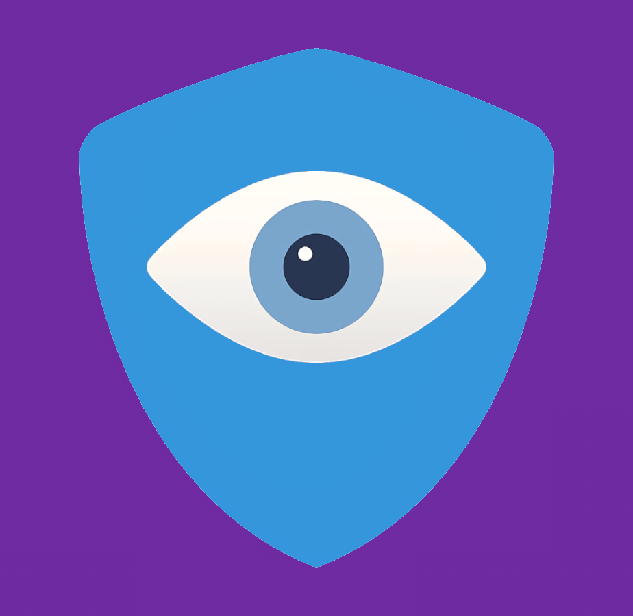
I’d be curious to see this symbol replacing the hand in the previous thread’s eye and palm.
I like that this alternately looks like a dove, or an open hand coming forward to slap some sense into me.
This is the least impressive logo of the 3
Is it about being “impressive”?
Well, fair enough. To me, anyone living up to human rights, is impressive to me. I don’t need an impressive logo - just a recognizable one.
Hey, I saw your comment in the other thread. Thank you for your engagement, this really shows that people care about their digital presence. However, in my opinion, your proposal is more related to data security than data privacy. I see how the two are interlinked but I really like the symbol of active resistance, symbolized by the hand, towards the big surveillance apparatus, depicted with the eye.
From a practical perspective, the other flag is also a bit simpler, if we replace the high-res hand with a simpler vector drawing.
I propose something like this:

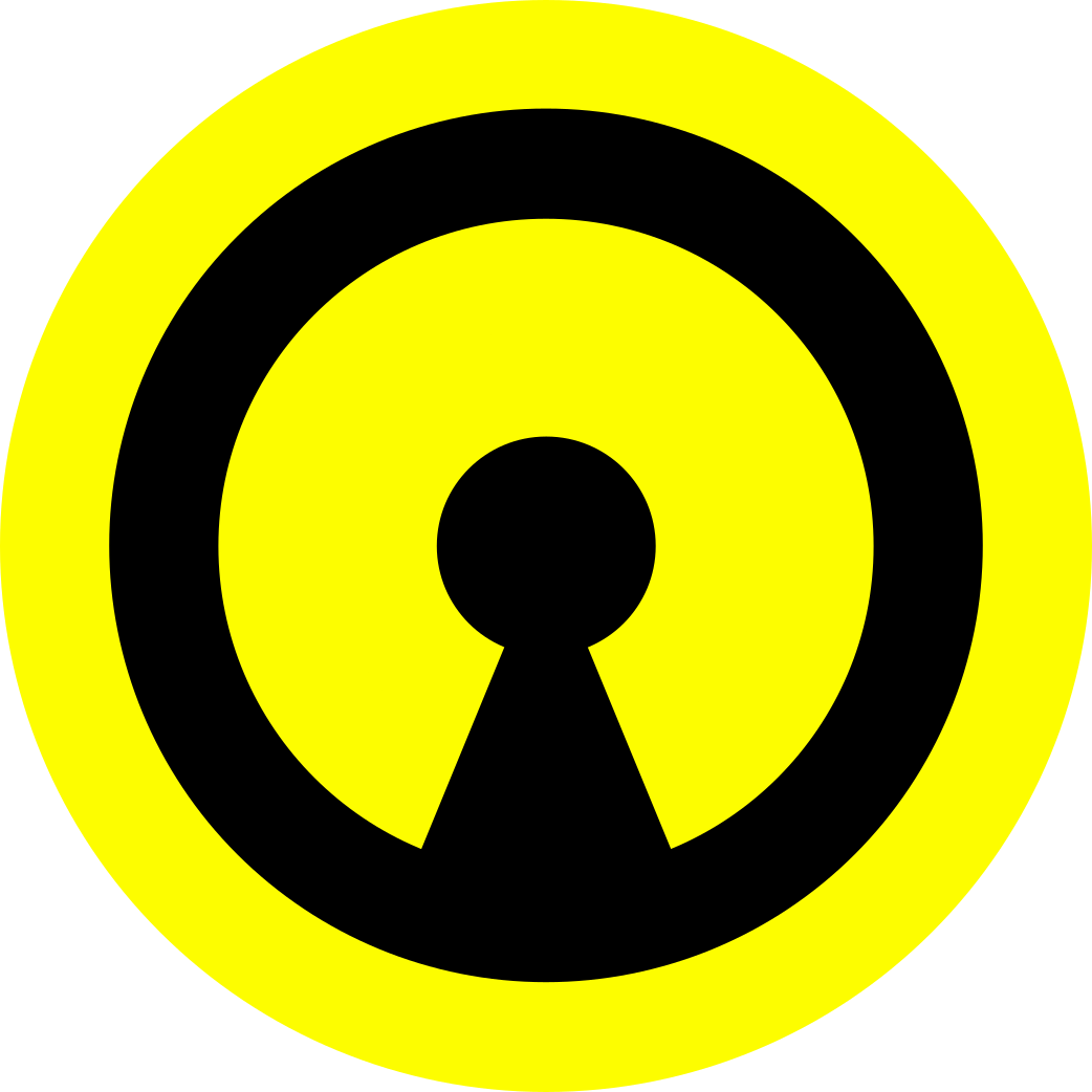
So far I like this version the best. However, someone put up the human rights logo and I think it would quite well here, since it’s a dove (as requested), but also looks a bit like a hand. Another request was the color black. Maybe make the pupil black? Pretty sure that covers the commitee’s requests.
Edit: something like this

I am seriously digging this one. Pretty self-explanatory, spot on in my opinion.
Do you mind if I use it for my profile Pic?
The simpler hand design in this one is definitely better. I did have one thought that I wanted to pose, however. Would the fingers being together instead of apart make much of a difference? I can almost see this design being symbolic of a ‘high five’ instead of a ‘halt!’
example:

I also thought about this but to me this seems more energetic stop sign. Like this one:
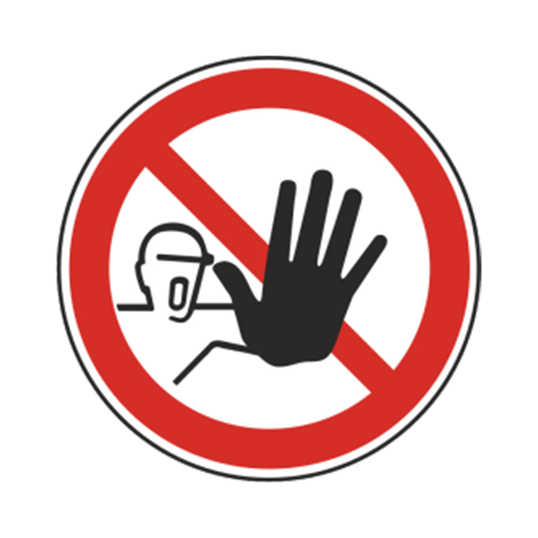
Maybe I could adjust the fingers a bit though…
This. It doesn’t make sense for the eye to be minimalistic and the hand to be very detailed. Either they are both detailed or both minimalistic.
I do like this version better than the other one with the detailed hand. That being said, to your point about data security, it’s more so that we’re sort of splitting a finite set of motifs. Even the icon for this community is a shield and an eye. The eye being the threat, not the community represented by the flag, IMO means minimizing the eye, though I can see how you would feel the “stop” hand in the eye does the same thing. I just don’t agree with that.
Also, just me personally, the all-blue just seems boring to me. This blue is slightly bluer, so it doesn’t give me the BSOD vibe at least, but this just seem closer to a logo for a data removal subscription service than a flag. Not that mine isn’t exactly far from that either, but still.
I see your point. Fair enough :)
Nice design! I kinda feel like dove in lock in shield is a bit much. Maybe try making them the same size and putting them side by side?
Well, if anything, the dove just goes away as being too cheesey.
Yeah the dove is the symbol of peace, not privacy.
I also liked the blue field. Black fields aren’t really a thing for flags.
I mean, I can think of a few black flags that are iconic.
Not to mention the band Black Flag.


