About
It has always bothered me that privacy has no unified symbol. Every community has their own take on how privacy should be visualized. I want to unify the privacy community across the internet. It is my belief that, with a universal symbol for privacy, we will grow stronger. We will have a symbol to represent us. We will have a flag to fly.
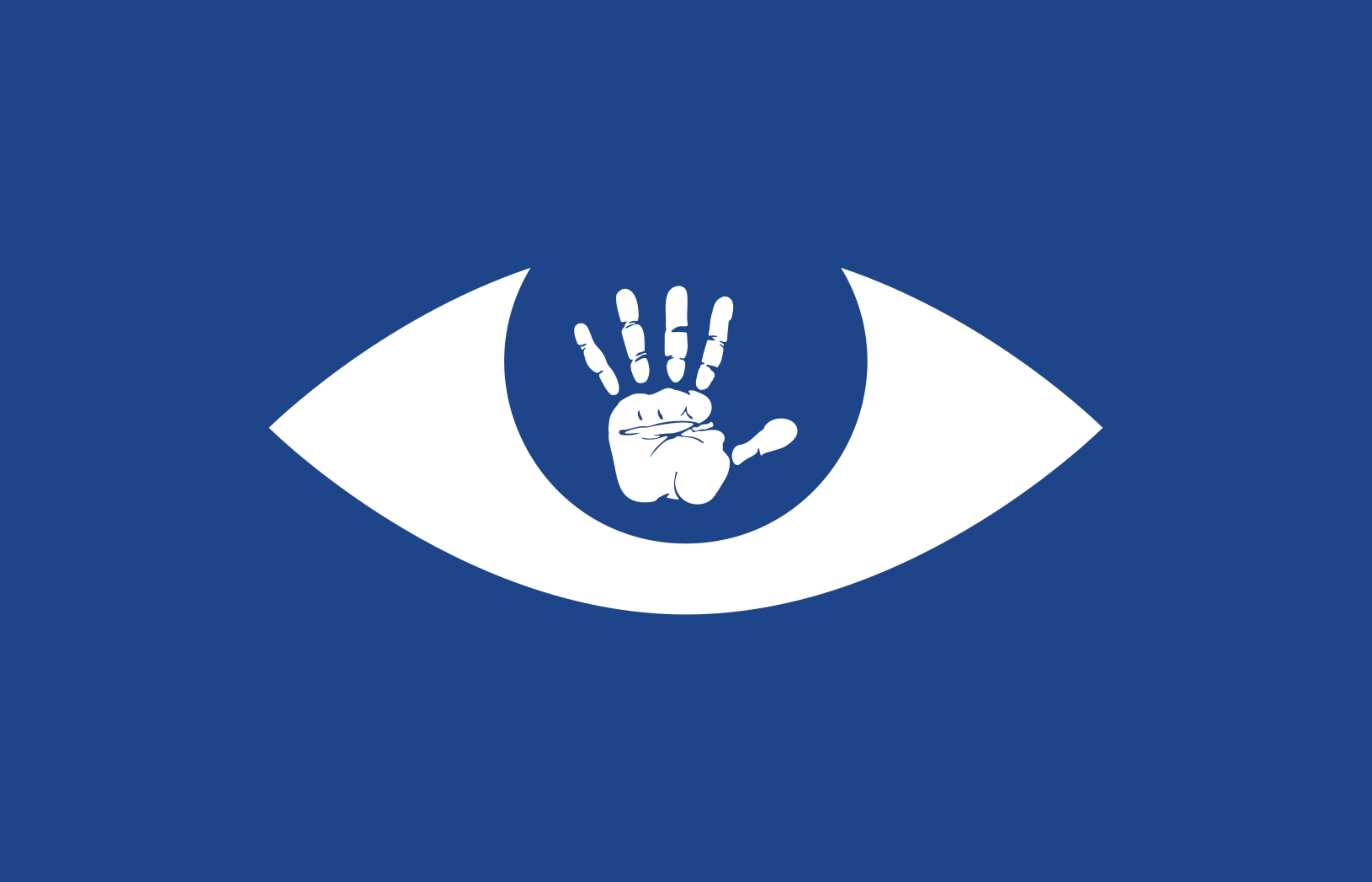
Icon
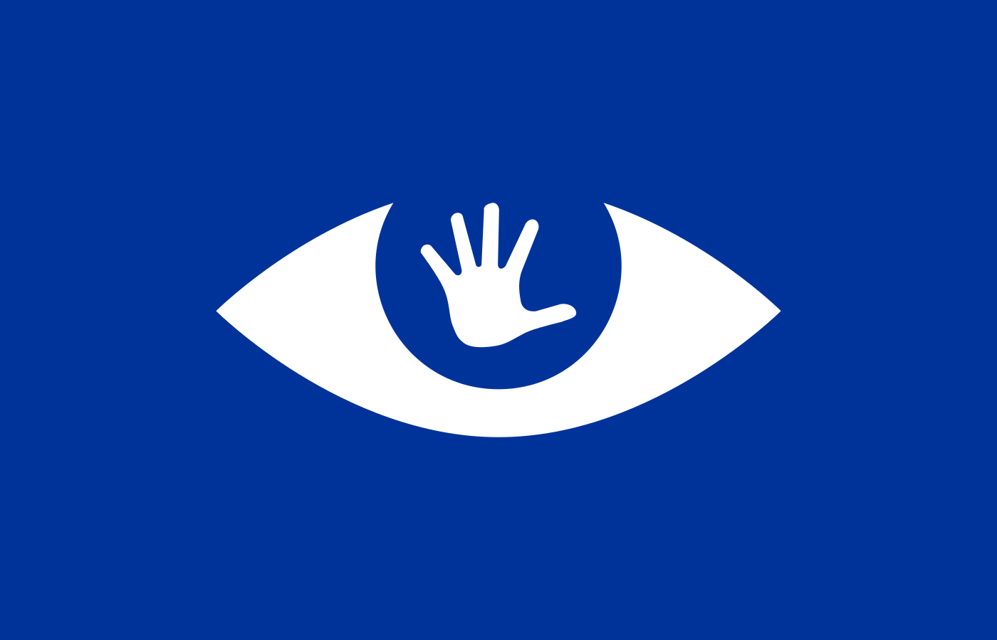
The icon is a clipart created by librarian Gordon Dylan Johnson which can be found here. The size of the icon is large enough to still fit if the flag is cropped to a square/circular aspect ratio.
Dimensions
The size of the flag is 140 by 90 centimeters. These dimensions are chosen because of the dimensions of a Tor Browser window (1400x900 pixels).
Colors
The color blue (Azure) was chosen because it symbolizes security, stability, and reliability. The exact shade of blue used is the same azure color used by the flag of Europe, because of GDPR.
Design
This flag follows the “Principals of design” for vexillography.
Use it!
Use this flag for group chats, communities, profiles, stickers, patches, articles, wallpapers, real flags, anything you want to! Spread it around so it becomes a global icon for privacy. Even put it on the Wikipedia page for privacy if you can!
Why is the eye more significant than the hand?
Cringe
i thought privacy have flag - anonymous
While i like the idea, this flag gives instant super-creepy vibes, i would NOT like to use it unless it’s for a bad guys faction in a game or story or something like that
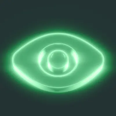
Looks amazing :) here’s how it is when flying
Looks amazing :)
Thank you!
here’s how it is when flying
Is there a version that doesn’t use WebGL?
No sadly, though I could record the flag if you want, to see without having to use webgl
That would be great, thank you! I have a hunch I’m not the only one with WebGL disabled.
Cool idea
first thought that came across my mind is the Black Hand of the Brotherhood of Nod
I guess it’s nice that it follows the principles of design for flags, but it still looks off somehow. the minimalism of the eye vs the more detailed hand print seemed at odds.
A simpler less detailed hand print IMO would look better. Like the Black Hand of Nod. also less detailed Hand print = less/no fingerprinting across internet
Yeah the hand is way too complicated and hard to identify from far away. Also, proper identification requires some amount of wind, which is not the kind of dependency you want to integrate into your flag design. That’s why stripes are so common.
I’m pretty sure every kid in kindergarten knows an easier way to draw a hand.
Black Hand of the Brotherhood of Nod
Empire of the Hand from Star Wars.
Added: yikes, lots of black hands, many unsavory.
Can you explain why you chose the hand and eye? A hand print is a very identifiable trait, so it seems counter to the idea of privacy.
As I mentioned in the post, the icon was created by Gordon Dylan Johnson. The way I interpret it is that the eye represents surveillance, and you are holding up your hand, which is the body language for “stop.”
Can we get one with a more feminine looking hand as well? That looks like Dr. Sausagefingers hand
I don’t know why you were downvoted. It looks stupid.
Yeah, I mean it looks like some edgy Dark Brotherhood shit from an Elder Scrolls game, not something with a respectable message such as the right to privacy.
Embed a tracking pixel in it!
Haha, kidding of course. This is cool!
Those are some fucked up palm lines. Heart line is okay ish, strong. Head and life lines are… I don’t event know if those have a boilerplate reading they are so unnatural. This pirate might be headed for the love of their life or an early, traumatic death. Godspeed.
I really like the idea of a flag to unify the privacy community but I’m going to go with the consensus with the hand: it’s probably a bit too complex. I think a flag should be easily made into a vector format that is easy to draw and replicate.
Say if someone wanted to draw a protest board with this on it. It would be really difficult to accurately draw the hand without good drawing skills.
It’s practically tradition for open source logos to be hideous I suppose.
Come on… you do not have to like it but at least don’t insult an entire field dedicated to helping fellow other beings while providing 0 suggestion.
You might be smart but you certainly are not kind.
Do better.
that’s sooo fetch!
I loved the idea, but I object to the symbology.
First off, we’re against being seen. Why would we want a big creepy eye as the definition of success? Did Pirate flags show shackles and gallows? Of course not.
What are common pictograms associated with privacy? Shields. Locks. Locks on shields. Privacy is about defense and control.
Second, the blue gives me BSOD vibes. I get the EU reference, but black is super obvious here. Black it out. Redacted. Blind. All right there.
My suggestions? A shield or lock with dove at its center. Because the mass surveillance state is one of fear, not freedom or peace. Black field with blue and white stripes, white representing freedom, blue as you have it, and I guess giving a nod to Estonia’s leadership in EU tech. Not that we need to rep Estonia, but I also liked their Eurovision entry this year.
You know what this flag needs?
Espresso Macchiato
I was going to bet anything I was going to click and it would say “More cowbell!”
Pleasantly surprised, thank you.


